Thursday, October 17, 2013

Adobe Creative Cloud: What You Worry?

Adobe Chief Marketing Officer Ann Lewnes (visual approximation)
Adobe Chief Marketing Officer Ann Lewnes is not a worrier.  And she doesn’t think you should be one, either.

Allow me to explain.

Adobe Get’s Hacked (and Maybe Into The Guinness Book of World Records)

Since I posted this story on October 17, 2013, it's gradually become clear that the fiasco that provoked it—a massive hack against software giant Adobe's web servers—was far, far greater than originally reported.  When Adobe Chief Security Office Brad Arkin confessed in a blog post on October 3 that attackers had compromised the names, encrypted credit or debit card numbers, expiration dates, and other customer-order information for some of its accounts it put the number at a mere 2.9 million.  Then, at the end of October it appeared that hackers had actually snagged 38 million accounts.  And now, in mid-November, the number has grown to 150 million and, since nature abhors a vacuum, web sites are sprouting up to allow you to enter your email address to see if you're one of the unlucky ones.

As Violet Blue reported on ZDNet on November 11, "As breaches go, you may very well see this one in the book of Guinness World Records next year, which would make it astonishing enough on its own."

And just as astonishing is this little tidbit from Mashable:
It was recently reported that the three most popular passwords among Adobe users are: "123456," "123456789," and "password" — a sign that users are picking easy-to-guess passwords.
But back to Adobe's Brad Arkin.  In announcing the breach he also stated that Adobe was resetting all relevant customer passwords and explained that “If your user ID and password were involved, you will receive an email notification from us with information on how to change your password.”

Sure enough, as a sometime Adobe user I have an Adobe ID.  (In fact, for reasons I can’t quite remember, I’ve got two.)  So a couple of days later I got the promised email:


(Aside: A couple of days seems like a long time for a company Adobe’s size—responding to a breach of 2.9 millions names—to alert me that attackers had illegally entered its network and possibly obtained my ID and password.  Perhaps I was deliberately placed at the tail end of the notifications because, thank God, I had no credit card information sitting on Adobe’s servers.  The last time I’d actually used my Adobe ID was to get some tech support for Adobe Digital Editions e-reader software—and luckily Digital Editions is a free download.)

What You Worry? Join the Adobe Creative Cloud!

So I was more than a little surprised when on October 15—less than a week and a half after Adobe had notified me to reset my password—I got an invitation from Adobe to join, explore, and create with its (recently revealed to be eminently hackable) Creative Cloud:


Yes, for only $49.99 per month—$599.88 per year—I, too, could download full versions of every Adobe app, get 20GB of cloud storage, create customized portfolios with a free Behance ProSite membership ... and spend my spare time wondering when MasterCard would call to ask if it really was me who just went on that outrageous shopping spree at Best Buy.

No thanks, Ms. Neu—I mean, Ms. Lewnes.  I’ll stand pat.

Oh, and Brad: I notice you haven't posted any updates to your original October 3 hacking alert on the Adobe website.  What, you worry?!?  Nah.

Postscript (12/12/13): Worried less than ever, Adobe continues to email those like me who have Adobe IDs but haven’t yet signed up for full-fledged Creative Cloud accounts.  Got another “Join. Explore. Create.” email today.  Seriously, Adobe: before you send out any more of these sunny promotions don’t you think you owe it to your prospects first to devote an email explaining all the industrial-strength security measures you’ve put in place to make sure a 150-million-account hack never happens again? After all, since you’ve decided to get out of the software-in-a-box business and get into the software-in-a-cloud business it’s sort of critical that your user base not be perpetually nervous about black hats hanging around jiggling your virtual doorknobs.

Monday, May 20, 2013

OK, Google: Maps, Map Maker, and All Those 6 Bond Streets

Now, with Google and online maps at our fingertips, what was once normal can be seen as uncivilized — like asking someone for directions to a house, restaurant or office, when they can easily be found on Google Maps.
—Nick Bilton, “Disruptions: Digital Era Redefining Etiquette”, Bits blog, New York Times, March 10, 2013
This post is dedicated to you, Nick.

In September 2012, when Apple rolled out the iPhone 5 and abandoned Google Maps for its disastrously not-ready-for-primetime homegrown map system, New York Times consumer tech columnist David Pogue blogged about “What Makes Google’s Maps So Good”.  In his post he revealed something I hadn’t known: Google Maps receives error reports “by the thousands” from human users via Google Map Maker.

Pogue described Map Maker as “a Web site that is live in 200 countries (and just started in the United States) that lets average citizens make corrections to Google’s maps as they find them.”  Excited to learn that Google Maps had the same kind of cool end user editability that Jimmy Wales had given Wikipedia, I headed right over to Google Map Maker to correct Maps’ misplaced address for the Tendai Buddhist Institute on Route 295 in East Chatham, New York.

Zen and the Art of Geolocation Maintenance

You see, the previous summer my wife and I were visited at our weekend house in East Chatham by a young Asian man on a motorcycle who was searching in vain for the Institute.  We were a bit stumped about why he’d roared up our driveway for directions, since our house, obscured by a vast stand of Norwegian furs, is completely invisible from the road.  But when I checked Google Maps on my LG Optimus V his reasoning was clear: Google had located the Buddhist retreat practically in our front yard.

In reality, though, it was (and is) a good half mile down the road.

Of course, when I used Map Maker to submit the correct address for the Tendai Buddhist Institute my expectations were low.  If Map Maker received error reports “by the thousands” from human users, how long would it take before mine was vetted, let alone accepted?  But within hours of submitting the change I received an email confirming its approval:


I was stunned.  True, it did take a few weeks for the correction to be pushed out to my—and everyone else’s—phone via a Google Maps update.  But it’s only natural for Google to bundle its Map Maker corrections and distribute them en masse at irregular intervals.

“Do You Know Where Bond Street Is?”

Then, months later, came another, far deeper Google Maps mystery.  That of 6 Bond Street, New York, NY.

It’s early evening on the last day of February and I’m walking my two dogs when a thirtysomething guy, his smartphone pulled out and Google Maps on display, asks me if I know where Bond Street is.  I’ve lived in Manhattan for over 20 years and in SoHo for nearly as long and Bond Street rings a bell for me, but I’m embarrassed to admit I can’t place it.

But hey: if thirtysomething guy has Google Maps on his phone, why can’t he place it?

It turns out he’s already visited the designated location, which is only about 50 yards from where we’re standing at the corner of Bleecker Street and Minetta Lane.  Google Maps insists it’s just uptown on Sixth Avenue.  I walk my dogs in this neighborhood all the time and I’m sure I’ve never seen a Bond Street around here.

Redundantly, I pull out my LG Optimus V and look at Google Maps myself.  Here’s what it showed me a day or two later when I took time to do a screen capture:

Google Maps’ default location for 6 Bond Street, New York, NY as displayed on my LG Optimus V. The red arrow shows where thirtysomething guy was standing when he asked me if I knew where Bond Street was.
My phone serves up the same nonexistent location his does.  I can see it isn’t right and tell him so.

This impoverished help prompts thirtysomething guy to thank me profusely, which only makes me more embarrassed that I’ve failed at what I regard as a New Yorker’s prime directive—to supply decent directions to tourists and other bewildered visitors to my neighborhood and environs.

Thirtysomething guy, however, is unruffled by Google’s misdirection and, waving his phone before me, fires up another app on his smartphone—“Have you seen this?” he asks me with a big grin—to ping a car service to pick him up.

He’s happy and I, the New Yorker who doesn’t know where Bond Street is—and, thanks to Google Maps, still doesn’t know where it is—find myself back on my dog walk, brooding about finding the real address and using Google Map Maker to fix it forever.

One Simple Address, Two Wrong Locations

Back at the apartment, I launch Google Maps on my desktop PC and search on “6 Bond St., New York, NY”.   It serves up the same nonexistent location thirtysomething guy and I got standing in front of American Apparel at Bleecker and Minetta:

Google Maps shows 6 Bond Street located in the middle of an apartment bloc on 6th Avenue.  Again, the red arrow shows where I ran into thirtysomething guy.  Google Maps' Did you mean: suggestion in the upper left nav—circled in red—makes clear Maps has an alternate address for 6 Bond Street in a different Zip code.
OK, Google: Did you mean: suggests you’ve got an alternate location for 6 Bond Street in Zip code 10013.  I click on the link to see where it is:

Google Maps’ Did you mean: alternate location for 6 Bond Street in Zip code 10013 puts it next to a Maserati of Manhattan dealership.  No actual Bond Street can be seen anywhere in the vicinity.
Good lord.  This one is farther downtown, below Canal Street in Tribeca, once again apparently on Sixth Avenue.  But as with the other location, there’s no thoroughfare marked Bond Street anywhere near the red A pushpin.  Google Maps displays two wrong locations for one simple address.

Doubting my sanity, I get a second opinion from the Amerigo Vespucci of browser map tools: MapQuest.   Where does it place 6 Bond St., New York, NY?

Sensibly, MapQuest displays 6 Bond Street on Bond Street.  (And without suggesting an alternate location.)  Once again, the red arrow shows where I ran into thirtysomething guy.  Turns out the real Bond Street was only about 10 blocks away from where we met—a 10-minute walk.
Thank God!  MapQuest displays a 6 Bond Street that’s actually on Bond Street.  Thirtysomething guy’s mystery address is a mere 10 blocks east of our fateful meeting spot—10 minutes on foot.  And mercifully, MapQuest doesn’t suggest alternate locations, either.  In the search for 6 Bond Street, MapQuest’s data is better than Google Maps’ data.

Time to head to Google Map Maker to fix this bizarre mess.

These Aren’t the Bond Streets You’re Looking For

Strangely, when I arrive at Google Map Maker I find that it displays 4 locations for 6 Bond Street—none of them the incorrect one near Minetta Lane that baffled thirtysomething guy and me.  However, it does show the Tribeca location next to Maserati of Manhattan.  So I opt to delete it first.

However, Google Map Maker wants a reason for the deletion and I find the choices a little confusing:


Am I deleting this 6 Bond Street because this Feature does not exist or because A duplicate of this feature exists?  Or are all these Bond Streets some kind of spam/abuse?

I go with A duplicate of this feature exists.  Later, after some equally befuddling correspondence with a member of The Google Mapmaker Team, this location is indeed deleted.

Unfortunately, that still leaves Google Map Maker showing a few 6 Bond Street locations that, unaccountably, don’t include the wrong one (just uptown along Sixth Avenue) that vexed thirtysomething guy and me:

After deleting 6 Bond Street next to Maserati of Manhattan  I see that Google Map Maker still brings up 3 locations—including the correct one—that Google Maps doesn’t bother showing me on my PC.  As before, the red arrow shows where I ran into thirtysomething guy.
Still, location A is clearly the correct one (with a proviso I’ll get to in a moment)—and yet it doesn’t seem to be even a Did you mean: option in Google Maps.  Then there’s location B, way over on the western edge of Manhattan, near the Hudson river—another place nowhere near a visible Bond Street.  But location C incenses me, because it’s situated in my own neighborhood, a mere 5 minute walk from my apartment, in a spot where I know there is no Bond Street.

It’s the location I decide to eradicate next:


Take a look at this Google Map Maker screen I captured in the midst of submitting this second correction.  First, there’s the preposterous location A pushpin for 6 Bond Street in the middle of a copse of trees that define the tiny Playground of the Americas (run by the NYC Parks Department) at the southeast corner of Sixth Avenue and West Houston Street.  Incredulous, I visit the location and take a picture myself:

Google Map Maker’s location C for 6 Bond Street, New York, NY turns out to be the Playground of the Americas on Sixth Avenue.  I visited the Playground on March 1, 2013 to take this snapshot, so the trees, of course, are leafless.
Then there are the culprits who apparently decided to contribute this particular 6 Bond Street to Map Maker: Google Automated Miscellaneous B… and Anonymous 4179.  (What were they thinking … assuming they’re actually “theys” and they actually “think”?)

After this deletion, however, I run into another difficulty.  While attempting to remove the next wrong location I get a pop-up dialog box telling me “This action will remove changes already in progress.  Do you want to continue?”  I’m not sure why Google Map Maker is warning me this way—is a Map Maker visitor permitted only one correction per session?  Does Map Maker not participate in Google’s one-account-logs-in-everywhere system?  Did I fail to log in properly because I’ve got more than one Gmail address?  I'm spooked and decide not to continue.

Dear Google Map Maker: About All Those 6 Bond Streets...

Later, I decide to write a lengthy feedback note to Google Map Maker laying out this dizzying multiplicity of 6 Bonds Streets.  I mention thirtysomething guy, the original bogus Google Map location for 6 Bond Street (which Google Map Maker doesn’t display!), the confusing pop-up dialog box warning me I'll lose changes already in progress—basically everything you’ve read so far.  I sum it up in a message I send March 6:
  • When searching for the address on my Android phone Google Maps displays an incorrect default location, with the push pin showing a point along Sixth Avenue just below Minetta Lane.  (I’ve walked to this location and studied it.  I can find no trace of a Bond St.)
  • It also shows the “Did you mean:” line at the top of the map, suggesting there is an alternate location for this address; however, in conducting this search repeatedly I’ve found that Google Maps seems to vary between showing 2 alternate locations for 6 Bond St. (both incorrect), and 3 alternate locations (one of which *is* correct).
  • Google Maps’ correct address for 6 Bond St., unlike all the others, actually depicts Bond St. on the map, but the Zip code attached to it is incorrect.  (It indicates that 6 Bond St. is in Zip code 10011, when in fact all of Bond St., which runs only a couple of crosstown blocks, is located within Zip code 10012.  See here: http://www.maptechnica.com/zip/10012.)
About that last bullet: Yes, even when Google Map Maker displayed the correct address for 6 Bond Street it still managed to apply the incorrect Zip code:


As the MapTechnica Zip code map I link to above makes clear:

All of Bond Street in New York City is located in Zip code 10012.

My Yeoman Efforts Pay Off

But today, thanks (I hope) to my yeoman behind-the-scenes efforts, searching on “6 Bond Street, New York, NY” brings up the correct address, in the correct Zip code, as the default:


Sure, you’ll notice there are still two other Did you mean: alternate locations—including a new one clear over in the East Village:


But I just discovered something wonderful in the lower righthand corner of the Google Maps screen: you can click through to Google Map Maker from any bogus location like this one:


Nice!  Think I'll head over there right now.

And Nick: the next time someone violates your sense of etiquette by asking for directions while holding a smartphone displaying Google Maps, calm yourself by repeating this mantra: Number 6 Bond Street, Number 6 Bond Street, Number 6 Bond Street.

Epilogue (1/27/2015): The warp velocity of Internet time seems to apply to Google Maps as much as to anything else on the web.  Since I published this post I can report the following: 1) The Tendai Buddhist Institutes’s Google Maps location has reverted to the same deeply inaccurate position it held when that young Asian man cycled up our driveway to ask about it during the summer of 2012.  I notified Google of the error a few days ago but have little confidence it will ever be correctly designated on Google Maps; 2) searching for 6 Bond Street, New York in Google Maps does indeed bring up the proper address—and without even one idiotic Did you mean: alternate locations; 3) Google has done away with the Edit in Google Map Maker option it used to display in the bottom righthand corner of any Google Maps map display; I'm guessing the company got far more edits, productive and unproductive, than Google’s skeletal team of Map Maker humans could possibly vet.

Saturday, April 6, 2013

Twitter Followers, Real Twitter Followers & Celebrity Twitter Followers


I’ve had a Mind The Rant Twitter account for about two years.  And during that time I’ve cultivated a vast throng of 117 loyal followers:


I know.  Not many.  Part of it is my fault: I don’t tweet enough.  And though it took me a while to cotton on to Twitter etiquette, which is nothing more than blatant logrolling, I’m proud to say I haven’t chosen to follow everyone who has chosen to follow me.

For instance, I’ve resisted those bizarre instant Twitter porn accounts where someone, putatively a hot woman, offers homespun aphorisms from The Hooker’s Almanac and provides a profile link to some URL with “sex” or “xxx” embedded in it.  I’m also sorta proud that the number of followers I maintain is always more than half the number of tweets I’ve posted.

But today I visited my account to see if I’d captured any new followers and discovered one of those instant ones—not a porn account, I’m relieved to say—from somebody named Renita Escarcega.  Renita has tweeted only 13 times, has 0 followers (4/7/13 update: 18 tweets and 112 followers!), and her profile contains only a link:


So, with a certain trepidation, I clicked on it and was taken to Twitter Valhalla, otherwise known as FollowersDelivery.com.

As FollowersDelivery.com promises, the site can help you
Get more Twitter Followers overnight, and strengthen your online credibility. Try the Safest, Fastest and Easiest way of getting Twitter Followers.
100% Guaranteed Twitter Followers, NO Account Password Required!
EXPRESS DELIVERY less than 24 hours
I was familiar with these appalling little businesses thanks to articles in the New York Times (one of which, “Fake Twitter Followers Becomes Multimillion-Dollar Business”, appeared only yesterday) but was still amused to discover that FollowersDelivery.com wisely distinguishes between delivering Twitter followers and Real Twitter followers, who are, naturally, twice the cost:


So how many Twitter followers does $20 buy?  Looks like 1,000.  Of course, economies of scale apply to harvesting Twitter followers just as naturally as harvesting wheat: $50 buys you 5,000 followers, $80 buys 10,000, $170 buys 30,000, and $420 buys a whopping 100,000 followers.  (That’s less than half a cent a follower!)

Of course, the more you want the longer it takes.  Up to 5,000 takes 24 hours, up to 30,000 takes 48 hours, and up to 100,000 takes 72 hours.  And for those 100,000 follower orders, you have to wonder how it’s done.  Delivering all of them for less than half a cent a piece at a profit suggests bots at work. Even in a developing country it seems implausible that anyone is willing to sign on to Amazon’s Mechanical Turk to create Twitter accounts for a quarter of a cent per account.

That’s where Real Twitter Followers come in.  They’re more costly and they take longer to harvest: 1,000 cost $40 and take an entire week to deliver.  That’s 4 cents per follower—so, I’d think, easily within reach of a Mechanical Turk job offering 2 cents per Twitter signup.  With Real Twitter Followers the upper limit is also far smaller: you can’t go higher than 10,000, and, perversely, they’ll cost you more per account than 1,000 followers: $580 or 5.8 cents per signup.

Yet after going back over the terms I discovered that FollowersDelivery.com claims that both Twitter Followers and Real Twitter Followers are sourced the same way, by real people:


And how about the most expensive Twitter followers of all?  Celebrities, of course!

Hey: looks like we’re in luck: FollowersDelivery.com is offering a $20-off special:


Expensive?  Sure.  But don’t forget:


Thursday, April 4, 2013

Goodreads, Amazon, Anna Karenina: Coincidence?

Last week, when Amazon announced that it had bought community reading site Goodreads for an undisclosed sum, there was plenty of sturm und drang about what Amazon would do with the treasure trove of Goodreads data about the books its members read, rate, and recommend.

Would Amazon start posting Goodreads reviews on Amazon?  Would it start selling cameras and lawn mowers to Goodreads members?  As the Wall Street Journal reported yesterday, Amazon’s acquisition has already “set off a backlash among some fans of the popular site who treasured its independence.”

So, as an Amazon customer and a Goodreads member, let me report an interesting coincidence.

Just last Saturday I added Richard Pevear and Larissa Volokhonsky’s translation of Tolstoy’s Anna Karenina to my Goodreads My Books list.  (I’m about a third of the way through it, with mixed impressions so far. When I'm done, will I join the ranks of the 10,292 Goodreads members who have already posted reviews?  Not sure.)

Imagine my surprise, then, when Amazon sent me an email this morning with the two-word subject line Anna Karenina.

When I opened it, this is what I saw:


Is Amazon taking advantage of Goodreads member data already?  Sure, this film adaptation of Anna Karenina is a recent release—hey, it’s the reason I started reading the novel in the first place—and yes, I’m a TiVo owner who has rented and bought movies and TV shows from the Amazon Instant Video Store, whose new movies this email is touting.

As I said, it could be just a coincidence.

Tuesday, March 12, 2013

Le papier ne sera jamais mort / Paper is not dead!

“…every piece of entertainment, like every political speech or swatch of advertising copy, has nightmarish accuracy as a triple-distilled image of a collective dream, habit or desire.”

So said James Agee 70 years ago.

I can’t compete with Agee’s eloquence, but advertising’s nightmarish accuracy in triple-distilling our collective dreams, habits, or desires sometimes seems profoundly superficial, which—depending on your preference for reading via paper or pixels—may determine your reaction to this brief French television commercial (not to worry: you needn’t know French to understand or appreciate it):


I do wonder about one apparently vital decision the advertising agency behind it, Leo Burnett, or the crew Burnett hired to create it, made in casting the father.  Assuming we’re hearing his actual voice, his accent sounds unmistakably American.

Am I jumping to conclusions thinking the (presumably French) casting director made this choice deliberately—that this man’s obsession with a tablet that looks unmistakably like the All-American iPad offers the French TV-viewing public one more opportunity to laugh at us and our technofetishism?

Kinda looks that way.

Postscript: my sister Leslie—who actually emailed me the link to this video and who speaks excellent French—demurred when I suggested to her that the father is (or is meant to be taken as) American.  She pointed out that when he pronounces his wife’s name he emphasizes the second syllable, “ma”, while an American would emphasize the first syllable, “em”.  I guess she’s right.

And it’s true that the commercial works hard to evade being pinned down linguistically or culturally.  In the father’s first intrusion—when he illustrates how perfect the tablet is for drawing—he avoids spelling out a word and simply swirls a couple of circles.  Then, later, the ad agency decided he should show his wife she could be using the tablet to solve a Sudoku puzzle instead of, say, a crossword.  Sticking with numbers once again preserves the commercial’s international appeal.  Very clever, these Mad Men.

Equally interesting is that the ad doesn’t insist on portraying Emma as a Luddite.  In one scene the crime in her husband’s eyes is that she’s printing something out while working on the home computer.  The implication here seems to be not merely that Emma has refused to go paperless but that she insists on using yesterday's cumbersome desktop technology (which requires its own room!) to accomplish tasks the sleek, portable tablet can handle anywhere.  She’s clinging to old, workaday tech instead of excitedly embracing tomorrow’s.  Which means Emma’s pretty much like all of us who are annoyed that the pace of change dictates we buy a new gadget every year or two—even when our old gadgets still work fine.

Wednesday, February 27, 2013

A Video Instruction Tool Called Teachem

Just discovered a website called Teachem.com that allows a person, organization, or business to repurpose instructional videos it has posted to YouTube.  It's easier to show how Teachem.com works than it is to explain it, so below I've posted the Securifi Almond Range Extender Demo I created in the Fall of 2012.

As you can see, once you've created the "classroom" version of your video on Teachem the site provides embeddable code you can insert into a blog page:


Beyond that, Teachem lets you start a virtual school by aggregating your courses in a central location and branding it with your organization's logo.  You can also take advantage of YouTube's versatility in allowing private videos to be uploaded; in such cases only those who enroll at your Teachem school can view and consume your content.

It's an interesting idea, though at the moment, because it's free to register at Teachem (and just as free to create courses with anyone's YouTube content -- not just your own), it's unclear what kind of revenue model the site's creators envision for it.

Tuesday, February 12, 2013

The New Yorker Magazine v. The New Yorker App

My wife subscribes to The New Yorker magazine, which means I can also read every issue on my first-gen Kindle Fire using the Amazon App Store’s New Yorker app.

Since receiving my Kindle Fire in November 2011 I’ve downloaded perhaps a dozen New Yorker issues and, despite the time and design savvy that obviously went into the app, by now I’d largely lost interest in reading the magazine this way.  Aside from the long download times each 75MB to 150MB issue requires (even with decent cable modem speeds it takes several minutes before one is ready to read), I found the added features—sound clips, slide shows, the occasional video—underwhelmng.  The printed word has always been what The New Yorker is all about.  The app, not surprisingly, didn’t seem to change that.

Until the other day.

Browsing the print edition issue for Feb. 11 & 18, 2013, I came across what I quickly decided was an all-too-cute profile of an artist whose strenuously whimsical paintings depicted one thing and one thing only: the grocery aisles at WalMart.  That article had been titled, predictably, “WALART”.  The first page looked like this:

"Walart", Susan Orlean, The New Yorker

With nothing better to do I read the piece, which wasn’t lengthy, and didn’t find much to change my mind about the artist, Brendan O’Connell.  He struck me as a lucky stiff who’d stumbled upon a formula for selling gimmicky, otherwise forgettable pictures about an (ironically) iconic American institution.  That he based his paintings on photographs he took himself—photographs that until recently got him thrown out of WalMart, which doesn’t allow picture-taking on its premises (but has now made an exception for O’Connell, because he’s become something of a celebrity)—didn’t change my opinion of him or his work.

Until a day or two later, when I downloaded the Feb 11 & 18, 2013 issue to my Kindle Fire.

If you take another look at the first page of the story (shown above) in the New Yorker’s print issue, you’ll see a picture of O’Connell in his Connecticut studio sitting in front of some of his works.  Now, as it happens, in the print edition that photograph is your sole means of evaluating O’Connell’s art.  There are no other examples of his paintings attached to the piece by Susan Orlean, which runs a mere 5 pages.

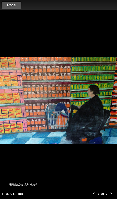
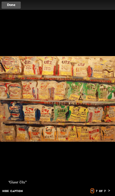
In the New Yorker app issue, however, you’re given a slide show of 7 of O’Connell’s paintings.  And when I viewed them (some I was already familiar with because Orlean had described them in her article), even on my Kindle Fire’s modest 7-inch screen I could scarcely believe they were done by the same guy gloating in front of those seemingly slapdash drippy Warhol-derivative riots of color you can barely make out in the print article’s one photograph.

Here’s the slideshow:

"Catskills", Brendan O'Connell
Note:  The New Yorker app appears unable to render slide shows like these in landscape mode.

"Whistlers Mother", Brendan O'Connell


"Wonder Bread", Brendan O'Connell
Note: The app does have a bug when you attempt to browse pictures using the left and right carets at the bottom right of the screen.  You'll notice this picture, which is actually entitled "Wonder Bread", has inadvertently retained the title  and number of the previous slide show picture, "Whistlers Mother"

"Foraging (I Want Candy)", Brendan O'Connell


"Checkout", Brendan O'Connell


"Elmers", Brendan O'Connell


"Giant Utz", Brendan O'Connell

Seeing even these tiny reproductions was shocking.  There was no question that “Catskills” was deft and playful and amusing.  I’m not sure I like the idea behind “Whistlers Mother”, since the name stems only from the profile of the woman on her Jazzy and its passing resemblance to Whistler’s portrait in profile of his mother; there’s also a Diane Arbus quality to the picture that detracts from its mirth.  “Wonder Bread”, on the other hand, is nearly (and improbably) photorealistic, done with just enough carelessness to magically suggest brushstrokes.  I’m not sure how I feel about “Foraging (I Want Candy)”; the girl’s tendrils of hair remind me somehow of Edvard Munch, which put it at odds with its bright colors and childhood subject.  I don’t feel qualified to comment on “Checkout” because the image (and perhaps the original?) is so damned tiny. (Update: actually, “Checkout” turns out to be a rather enormous 7 feet by 8 feet.)  But “Elmers” is quietly joyous for anyone who’s ever made art in grade school, and “Giant Utz” manages to depart magnificently from the near photorealism of “Wonder Bread”.  It defiantly pulls apart the integrity of the Utz snack bags and their designs and very nearly, but not quite, discards them for an abstract study in chaotic yellow, orange, and green rectangles that slightly resemble shooting gallery targets.  It is genuinely whimsical and just plain fun.  As are most of these works.

So while I may not have fallen in love with everything in the slideshow, is there any question I was humbled by this experience and more than a little troubled by it?  How could I have read this article on Brendan O’Connell via two different delivery platforms that brought me to two such entirely different conclusions about the man and his art?

There’s a message here for those trying to reinvent magazines or illustrated books or any medium that relies on conveying images well.  It begins with the vexing reality that image-intensive files tend to be enormous (this New Yorker app edition weighed in at about 153 MB) and time-consuming to download, making them unwieldy and unattractive, and ends with the invigorating if obvious conclusion that if you want to write about an artist you’d better show professionally scanned samples that bring his or her work to life.

Inviting readers to appraise an artist’s work and not just hear a good story about it—to take them by the lapels and insist they look at some pieces—enjoins them to pay attention and take an active role.  I know we’re not accustomed to thinking of reading as passive, but in this case, for me, it was.

I jumped to conclusions, Mr. O’Connell.  For that I apologize.

Postscript: Brendan O’Connell appeared as a guest on The Colbert Report on March 6, 2013.  His “Giant Utz”—which O’Connell refers to on the show as “Great Big Utz”—was one of the pictures Colbert displayed during the interview.   I was surprised to hear O’Connell refer to “Great Big Utz” as a very large painting (“like 7 feet by 8 feet”) with, after some prodding by Stephen Colbert, a very large price to match: $40,000.  So as limited as The New Yorker magazine’s profile of O’Connell may be, I guess The New Yorker app’s slide show on my 7-inch Kindle Fire had its own limitations.

*          *          *

For a slightly different take on what can happen when words and graphics are embedded together in a file, see the difficulties I encountered reading the so-called Powerpoint chapter of Jennifer Egan’s novel A Visit From the Goon Squad on my android phone and first-gen Nook.

Tuesday, February 5, 2013

Bookish Launches ... and Shows Growing Pains

Update: I've just realized that my post is misleading because my misadventures with Bookish took place primarily because I focused on choices involving an ebook edition and not a print edition.  My explanation will make more sense if you read the post first, so I'm adding it below as a postscript.

Unless you’re a diehard publishing nerd you’ve likely never heard of Bookish—a joint venture of Simon & Schuster, Hachette Book Group and Penguin Group (USA) that’s seemingly been gestating forever (but in real life for only a couple of years) and finally launched today yesterday.

As CEO Ardy Khazaei explains, Bookish is an online bookseller “created to serve as a champion of books, writers and, most importantly, readers” and, by seeking “to expand the overall marketplace for books”, declares itself impartial about “whether a book gets into a reader's hands via Bookish's e-commerce partner or another retailer, [because that way] everyone — from the publisher, to the retailer, the author and the reader — wins.

So yes, Bookish sells the books it displays via its “e-commerce partner”, book distributor Baker & Taylor, as well as willingly sending visitors to Amazon, Barnes & Noble.com, Books-a-Million, IndieBound, or Kobo if they’d rather complete their purchase elsewhere.  Of course, given the rather lengthy head start these other online vendors have had in selling printed books and ebooks and cultivating a loyal customer base it’s hard to imagine why anyone would begin their book search on Bookish instead.

Nonetheless, curious to know what the site offers and how it operates I set up an account and started browsing.  Not surprisingly, the young site shows growing pains.

My Tale of American Innovation

Clicking on the Subjects menu at the top of the home page, I landed on the Business page (which I once merchandised for Barnes & Noble.com) and scrolling down was intrigued by a collection titled Tales of American Innovation, from Bell Labs to Apple, where I found a book, Dealers of Lightning: Xerox PARC and the Dawn of the Computer Age, that sounded interesting.

But when I checked the price in the upper righthand corner of the product page I was surprised—and a little puzzled—to see that I was looking at an ebook that was “Not in stock. May be available elsewhere.”


I figured the ONLINE STORES button would tell me about places where the book might be “available elsewhere”, so I clicked on it and sure enough …


... there were my choices.

Click on Barnes and Noble, Go to Amazon

Unfortunately, clicking on the Amazon link didn’t take me to Amazon’s page for Dealers of Lightning. Instead, it took me to Amazon’s home page.  Then, oddly, I found that clicking on Barnes and Noble also took me to Amazon’s home page. [2/6/13 update: last night I emailed support@bookish.com to notify them of this problem and, to my amazement, just after midnight received a reply notifying me the snafu "has been solved." But when I refreshed the page this morning and tried clicking on Barnes and Noble I was still sent to Amazon.  Possibly the correction has been queued and will go live with other corrections a bit later.]  Next, I discovered that the Books a million link (attention, Bookish: the bookseller’s name is spelled Books-a-Million) failed to go anywhere except to a cleverly designed 404 page not found display:

It might take you a moment to notice that the book being displayed in Bookish’s 404 page not found graphic shows that page 404 has been torn out and is missing.  Cute, huh?
Inevitably, the iBookstore link takes you to Apple’s web page for downloading the company’s iTunes software, without which one cannot buy an ebook from Apple.  But mercifully, the IndieBound and Kobo links function properly, though they, too, take you to each online store’s home page and not to its Dealers of Lightning product page.

Whoa: Other Formats and Editions, Too?

Curiously, though, I quickly learned my options didn’t end there.  Just below the eBook box was this:


So right off the bat I could see that somewhere else I could buy this ebook for $11.04 instead of Bookish’s $11.99 list price.

And that + sign suggested there were more buying options to explore, so I clicked on it:


Then, of course, I saw the Show all ebooks (7) link and compulsively clicked it.  To my surprise I got a large pop-up:


OK, I thought.  These options, though admittedly not competitive from a price standpoint (five of the seven are $11.99, after all), seem to supply a multitude of vendor choices.  But $11.04 was clearly the best deal, so I clicked on it and landed on a Bookish Dealers of Lightning product page unlike the one I’d first visited.  Here’s how its price box read:


This was starting to get a little weird.  Remember that when I initially landed on the Dealers of Lightning product page Bookish had informed me that the ebook was “Not in Stock.”  But that it “May be available elsewhere.”  Was this elsewhere?

Not in Stock Yet Somehow Ready to Buy Now

Not noticing that the lower price and BUY NOW button weren’t the only thing different about this Dealers of Lightning price box—I failed to read that I was now being exhorted to “Read with the Bookish Reader app on Android, iPad & iPhone coming soon”—I clicked the BUY NOW button to see what would happen next.

Quickly I was being asked to enter my billing address and payment information, which suggested to me that, contrary to Bookish’s initial claim that this ebook wasn’t in stock, I was being asked to pay for something Bookish had every intention of delivering as soon as I entered a valid MasterCard, American Express, Discover, or Visa card number.  Though I didn’t follow through and buy the book, I’m guessing that had I done so I’d have received an ePub file I could have read via the popular Calibre PC reader or sideloaded onto any ereader, such as those from Nook or Kobo, that supports the ePub format.

Finally, I should note that despite Bookish’s nonpartisan approach to bookselling—and its willingness to send me to my preferred vendor—its price lists, I suppose inevitably, aren’t up to the minute.  When I went to Amazon and searched on Dealers of Lightning I discovered that the Kindle edition was selling for less than the lowest price Bookish had already shown me:


Here’s hoping Bookish can solve some of these vexing problems—especially the one about sending visitors directly to another online vendor’s product page instead of to its (far less convenient) home page.

2/6/13 Update: Bookish does send visitors directly to the product page on Amazon, Barnes and Noble, Books-a-Million, IndieBound, and Kobo if their Bookish jump off page is for the print edition of a book and not for the ebook edition.  The reason is simple: for ebooks Bookish supports (and is writing Android, iPhone, and iPad ereader apps that can display) only ePub and PDF document file formats and not Amazon's MOBI format for the Kindle.  So when it supplies Amazon as a purchase option for an ebook it faces a dilemma: it doesn't want to send Bookish users directly to Amazon's corresponding Kindle page because the ebook they purchase won't be readable on the Bookish ereader app.  So I'm guessing Bookish has decided the default in these cases is to send visitors to the online vendor's home page.  If so, it's still an odd choice since, as I mentioned earlier, Barnes and Noble and Kobo (as well as the iBookstore and, I suspect, Books-a-Million and IndieBound) all support the ePub file format for their homegrown ereaders.

Tuesday, January 8, 2013

A Money-Saving Idea for John L. Workman, CEO, Omnicare, Inc.


Dear Mr. Workman:

How’s it going?  I notice you’ve been CEO of Omnicare only since October 2012, so maybe you haven’t found your sea legs yet.

(BTW: Are you the CEO or the interim CEO?  Things seem to be in flux over there at Omnicare, what with Joel Gemunder resigning in 2010 and then suing the company for breach of his $146 million separation agreement, and then his replacement, John Figueroa, quitting in June 2012, apparently because Omnicare had to pay $50 million [according to USAToday] “to settle allegations that it improperly dispensed drugs for nursing home patients without a doctor's signed prescription”.  Wow, three CEOs in three years.  Looks like you’re in a tough business!)

But you’ll be happy to know I’m writing to you with an idea that can save your company tens of thousands—maybe hundreds of thousands, even millions—of dollars a year.

I hit upon this idea when, as the proxy who pays my mother’s pharmacy bills (she’s no longer well enough to pay them herself, you understand), I recently received one of those serious 1st NOTICE past due account letters from your company.

Here it is, with just a few details blurred out to protect my mom’s privacy:


Did you look it over?  Did you see those spots I circled in red?  I bet you already know what I’m going to suggest Omnicare do!

That’s right: skip billing customers whose balance due is $0.00.

Now, of course, I don’t know how many zero dollar past due account letters Omnicare mails out every year, but I’m guessing it could be more than a few.  Why not get one of your database gurus to write some code—I’m not a tech nerd, so I don’t know how the lines would read—to have Omnicare’s servers only generate a past due account letter when the balance due is greater than $0.00.

You could even play it safe and only generate a letter when the balance due is greater than or equal to, say, $1.00.  (I don’t know how much your dunning letters cost to print and mail, but your database gurus could certainly ask and make sure those letters don’t fire until those costs are fully covered.)

And no, I’m not going to stand on ceremony and demand a royalty for implementing a sure-fire money-saving suggestion like this one.  A lesser man might insist on 2% or 3% of your annual savings as a kind of finder’s fee, but not me.

I bring this idea to your attention and ask only that you give it your full consideration.

Thanks for listening.

Sincerely,

Richard Hartzell
Principal Rantiste
MindTheRant.com