Just discovered a website called Teachem.com that allows a person, organization, or business to repurpose instructional videos it has posted to YouTube. It's easier to show how Teachem.com works than it is to explain it, so below I've posted the Securifi Almond Range Extender Demo I created in the Fall of 2012.
As you can see, once you've created the "classroom" version of your video on Teachem the site provides embeddable code you can insert into a blog page:
Beyond that, Teachem lets you start a virtual school by aggregating your courses in a central location and branding it with your organization's logo. You can also take advantage of YouTube's versatility in allowing private videos to be uploaded; in such cases only those who enroll at your Teachem school can view and consume your content.
It's an interesting idea, though at the moment, because it's free to register at Teachem (and just as free to create courses with anyone's YouTube content -- not just your own), it's unclear what kind of revenue model the site's creators envision for it.

Wednesday, February 27, 2013
Tuesday, February 12, 2013
The New Yorker Magazine v. The New Yorker App
My wife subscribes to The New Yorker magazine, which means I
can also read every issue on my first-gen Kindle Fire using the Amazon App
Store’s New Yorker app.
Since receiving my Kindle Fire in November 2011 I’ve
downloaded perhaps a dozen New Yorker issues
and, despite the time and design savvy that obviously went into the app, by now
I’d largely lost interest in reading the magazine this way. Aside from the long download times each 75MB
to 150MB issue requires (even with decent cable modem speeds it takes several minutes
before one is ready to read), I found the added features—sound clips, slide
shows, the occasional video—underwhelmng.
The printed word has always been what The New Yorker is all about. The app, not surprisingly, didn’t seem to change that.
Until the other day.
Browsing the print edition issue for Feb. 11 & 18, 2013, I came across what I quickly decided was an all-too-cute profile of an artist
whose strenuously whimsical paintings depicted one thing and one thing only:
the grocery aisles at WalMart. That article
had been titled, predictably, “WALART”.
The first page looked like this:

With nothing better to do I read the piece, which wasn’t
lengthy, and didn’t find much to change my mind about the artist, Brendan O’Connell. He struck me as a lucky stiff who’d stumbled
upon a formula for selling gimmicky, otherwise forgettable pictures about an (ironically)
iconic American institution. That he
based his paintings on photographs he took himself—photographs that until
recently got him thrown out of WalMart, which doesn’t allow picture-taking on
its premises (but has now made an exception for O’Connell, because he’s become
something of a celebrity)—didn’t change my opinion of him or his work.
Until a day or two later, when I downloaded the Feb 11 & 18, 2013 issue to my Kindle
Fire.
If you take another look at the first page of the story
(shown above) in the New Yorker’s
print issue, you’ll see a picture of O’Connell in his Connecticut studio
sitting in front of some of his works.
Now, as it happens, in the print edition that photograph is your sole means
of evaluating O’Connell’s art. There are
no other examples of his paintings attached to the piece by Susan
Orlean, which runs a mere 5 pages.
In the New Yorker
app issue, however, you’re given a slide show of 7 of O’Connell’s paintings. And when I viewed them (some I was already familiar
with because Orlean had described them in her article), even on my Kindle Fire’s modest 7-inch screen I could scarcely believe
they were done by the same guy gloating in front of those seemingly slapdash drippy Warhol-derivative riots of color you can barely make out in the print article’s one photograph.
Here’s the slideshow:
 |
| Note: The New Yorker app appears unable to render slide shows like these in landscape mode. |

 |
| Note: The app does have a bug when you attempt to browse pictures using the left and right carets at the bottom right of the screen. You'll notice this picture, which is actually entitled "Wonder Bread", has inadvertently retained the title and number of the previous slide show picture, "Whistlers Mother" |
\", Brendan O'Connell")


Seeing even these tiny reproductions was shocking. There was no question that “Catskills” was deft and playful and amusing. I’m not sure I like the idea behind “Whistlers Mother”, since the name stems only from the profile of the woman on her Jazzy and its passing resemblance to Whistler’s portrait in profile of his mother; there’s also a Diane Arbus quality to the picture that detracts from its mirth. “Wonder Bread”, on the other hand, is nearly (and improbably) photorealistic, done with just enough carelessness to magically suggest brushstrokes. I’m not sure how I feel about “Foraging (I Want Candy)”; the girl’s tendrils of hair remind me somehow of Edvard Munch, which put it at odds with its bright colors and childhood subject. I don’t feel qualified to comment on “Checkout” because the image (and perhaps the original?) is so damned tiny. (Update: actually, “Checkout” turns out to be a rather enormous 7 feet by 8 feet.) But “Elmers” is quietly joyous for anyone who’s ever made art in grade school, and “Giant Utz” manages to depart magnificently from the near photorealism of “Wonder Bread”. It defiantly pulls apart the integrity of the Utz snack bags and their designs and very nearly, but not quite, discards them for an abstract study in chaotic yellow, orange, and green rectangles that slightly resemble shooting gallery targets. It is genuinely whimsical and just plain fun. As are most of these works.
So while I may not have fallen in love with everything in the slideshow, is there any question I was humbled by this experience and
more than a little troubled by it? How
could I have read this article on Brendan O’Connell via two different delivery
platforms that brought me to two such entirely different conclusions about the man and his art?
There’s a message here for those trying to reinvent
magazines or illustrated books or any medium that relies on conveying images
well. It begins with the vexing reality
that image-intensive files tend to be enormous (this New Yorker app edition weighed in at about 153 MB) and time-consuming to download, making them
unwieldy and unattractive, and ends with the invigorating if obvious conclusion
that if you want to write about an artist you’d better show professionally
scanned samples that bring his or her work to life.
Inviting readers to appraise an artist’s work and not just hear a good story about it—to take them by the lapels and insist they look at some pieces—enjoins them to pay attention and take an active role. I know we’re not accustomed to thinking of reading as passive, but in this case, for me, it was.
Inviting readers to appraise an artist’s work and not just hear a good story about it—to take them by the lapels and insist they look at some pieces—enjoins them to pay attention and take an active role. I know we’re not accustomed to thinking of reading as passive, but in this case, for me, it was.
I jumped to conclusions, Mr. O’Connell. For that I apologize.
Postscript: Brendan O’Connell appeared as a guest on The Colbert Report on March 6, 2013. His “Giant Utz”—which O’Connell refers to on the show as “Great Big Utz”—was one of the pictures Colbert displayed during the interview. I was surprised to hear O’Connell refer to “Great Big Utz” as a very large painting (“like 7 feet by 8 feet”) with, after some prodding by Stephen Colbert, a very large price to match: $40,000. So as limited as The New Yorker magazine’s profile of O’Connell may be, I guess The New Yorker app’s slide show on my 7-inch Kindle Fire had its own limitations.
For a slightly different take on what can happen when words and graphics are embedded together in a file, see the difficulties I encountered reading the so-called Powerpoint chapter of Jennifer Egan’s novel A Visit From the Goon Squad on my android phone and first-gen Nook.
Postscript: Brendan O’Connell appeared as a guest on The Colbert Report on March 6, 2013. His “Giant Utz”—which O’Connell refers to on the show as “Great Big Utz”—was one of the pictures Colbert displayed during the interview. I was surprised to hear O’Connell refer to “Great Big Utz” as a very large painting (“like 7 feet by 8 feet”) with, after some prodding by Stephen Colbert, a very large price to match: $40,000. So as limited as The New Yorker magazine’s profile of O’Connell may be, I guess The New Yorker app’s slide show on my 7-inch Kindle Fire had its own limitations.
* * *
For a slightly different take on what can happen when words and graphics are embedded together in a file, see the difficulties I encountered reading the so-called Powerpoint chapter of Jennifer Egan’s novel A Visit From the Goon Squad on my android phone and first-gen Nook.
Tuesday, February 5, 2013
Bookish Launches ... and Shows Growing Pains
Update: I've just realized that my post is misleading because my misadventures with Bookish took place primarily because I focused on choices involving an ebook edition and not a print edition. My explanation will make more sense if you read the post first, so I'm adding it below as a postscript.
Unless you’re a diehard publishing nerd you’ve likely never heard of Bookish—a joint venture of Simon & Schuster, Hachette Book Group and Penguin Group (USA) that’s seemingly been gestating forever (but in real life for only a couple of years) and finally launchedtoday yesterday.
My Tale of American Innovation


Click on Barnes and Noble, Go to Amazon

Then, of course, I saw the Show all ebooks (7) link and compulsively clicked it. To my surprise I got a
large pop-up:

OK, I thought. These
options, though admittedly not competitive from a price standpoint (five of the
seven are $11.99, after all), seem to supply a multitude of vendor
choices. But $11.04 was clearly the best
deal, so I clicked on it and landed on a Bookish Dealers of Lightning product page unlike the one I’d first visited. Here’s how its price box
read:

Not in Stock Yet Somehow Ready to Buy Now

Here’s hoping Bookish can solve some of these vexing problems—especially the one about sending visitors directly to another online vendor’s product page instead of to its (far less convenient) home page.
2/6/13 Update: Bookish does send visitors directly to the product page on Amazon, Barnes and Noble, Books-a-Million, IndieBound, and Kobo if their Bookish jump off page is for the print edition of a book and not for the ebook edition. The reason is simple: for ebooks Bookish supports (and is writing Android, iPhone, and iPad ereader apps that can display) only ePub and PDF document file formats and not Amazon's MOBI format for the Kindle. So when it supplies Amazon as a purchase option for an ebook it faces a dilemma: it doesn't want to send Bookish users directly to Amazon's corresponding Kindle page because the ebook they purchase won't be readable on the Bookish ereader app. So I'm guessing Bookish has decided the default in these cases is to send visitors to the online vendor's home page. If so, it's still an odd choice since, as I mentioned earlier, Barnes and Noble and Kobo (as well as the iBookstore and, I suspect, Books-a-Million and IndieBound) all support the ePub file format for their homegrown ereaders.
Unless you’re a diehard publishing nerd you’ve likely never heard of Bookish—a joint venture of Simon & Schuster, Hachette Book Group and Penguin Group (USA) that’s seemingly been gestating forever (but in real life for only a couple of years) and finally launched
As CEO Ardy Khazaei
explains, Bookish is an online bookseller “created to serve as a champion of
books, writers and, most importantly, readers” and, by seeking “to expand the
overall marketplace for books”, declares itself impartial about “whether a book gets into a
reader's hands via Bookish's e-commerce partner or another retailer, [because that way]
everyone — from the publisher, to the retailer, the author and the reader —
wins.
So yes, Bookish sells the books it displays via its “e-commerce
partner”, book distributor Baker & Taylor, as well as willingly sending
visitors to Amazon, Barnes & Noble.com, Books-a-Million, IndieBound, or
Kobo if they’d rather complete their purchase elsewhere. Of course, given the rather lengthy head start
these other online vendors have had in selling printed books and ebooks and
cultivating a loyal customer base it’s hard to imagine why anyone would begin
their book search on Bookish instead.
Nonetheless, curious to know what the site offers and how it
operates I set up an account and started browsing. Not surprisingly, the young site shows growing pains.
My Tale of American Innovation
Clicking on the Subjects menu at the top of the home page, I
landed on the Business page (which I once merchandised for Barnes &
Noble.com) and scrolling down was intrigued by a collection titled Tales of American
Innovation, from Bell Labs to Apple, where I found a book, Dealers
of Lightning: Xerox PARC and the Dawn of the Computer Age, that sounded
interesting.
But when I checked the price in the upper righthand corner
of the product page I was surprised—and a little puzzled—to see that I was
looking at an ebook that was “Not in stock. May be available elsewhere.”
I figured the ONLINE STORES button would tell
me about places where the book might be “available elsewhere”, so I clicked on
it and sure enough …
... there were my choices.
Click on Barnes and Noble, Go to Amazon
Unfortunately, clicking on the Amazon link didn’t take me to Amazon’s page for Dealers of Lightning. Instead, it took
me to Amazon’s home page. Then, oddly, I
found that clicking on Barnes and Noble
also took me to Amazon’s home page. [2/6/13 update: last night I emailed support@bookish.com to notify them of this problem and, to my amazement, just after midnight received a reply notifying me the snafu "has been solved." But when I refreshed the page this morning and tried clicking on Barnes and Noble I was still sent to Amazon. Possibly the correction has been queued and will go live with other corrections a bit later.] Next, I discovered that the Books
a million link (attention, Bookish: the bookseller’s name is spelled
Books-a-Million) failed to go anywhere
except to a cleverly designed 404 page
not found display:
 |
| It might take you a moment to notice that the book being displayed in Bookish’s 404 page not found graphic shows that page 404 has been torn out and is missing. Cute, huh? |
Inevitably, the iBookstore
link takes you to Apple’s web page for downloading the company’s iTunes software,
without which one cannot buy an ebook from Apple. But mercifully, the IndieBound and Kobo links
function properly, though they, too, take you to each online store’s home page
and not to its Dealers of Lightning
product page.
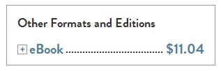
Whoa: Other Formats and Editions, Too?
Whoa: Other Formats and Editions, Too?
Curiously, though, I quickly learned my options didn’t end
there. Just below the eBook box was
this:
So right off the bat I could see that somewhere else I could
buy this ebook for $11.04 instead of Bookish’s $11.99 list price.
And that + sign suggested there were more buying options to
explore, so I clicked on it:

This was starting to get a little weird. Remember that when I initially landed on the Dealers of Lightning product page
Bookish had informed me that the ebook was “Not in Stock.” But that it “May be available elsewhere.” Was this elsewhere?
Not in Stock Yet Somehow Ready to Buy Now
Not noticing that the lower price and BUY NOW button weren’t
the only thing different about this Dealers
of Lightning price box—I failed to read that I was now being exhorted to “Read
with the Bookish Reader app on Android, iPad & iPhone coming soon”—I clicked
the BUY NOW button to see what would happen next.
Quickly I was being asked to enter my billing address and
payment information, which suggested to me that, contrary to Bookish’s initial
claim that this ebook wasn’t in stock, I was being asked to pay for something
Bookish had every intention of delivering as soon as I entered a valid
MasterCard, American Express, Discover, or Visa card number. Though I didn’t follow through and buy the
book, I’m guessing that had I done so I’d have received an ePub file I could have
read via the popular Calibre PC reader or
sideloaded onto any ereader, such as those from Nook or Kobo, that supports the
ePub format.
Finally, I should note that despite Bookish’s nonpartisan
approach to bookselling—and its willingness to send me to my preferred vendor—its
price lists, I suppose inevitably, aren’t up to the minute. When I went to Amazon and searched on Dealers of Lightning I discovered that the Kindle edition was selling for less
than the lowest price Bookish had already shown me:

Here’s hoping Bookish can solve some of these vexing problems—especially the one about sending visitors directly to another online vendor’s product page instead of to its (far less convenient) home page.
2/6/13 Update: Bookish does send visitors directly to the product page on Amazon, Barnes and Noble, Books-a-Million, IndieBound, and Kobo if their Bookish jump off page is for the print edition of a book and not for the ebook edition. The reason is simple: for ebooks Bookish supports (and is writing Android, iPhone, and iPad ereader apps that can display) only ePub and PDF document file formats and not Amazon's MOBI format for the Kindle. So when it supplies Amazon as a purchase option for an ebook it faces a dilemma: it doesn't want to send Bookish users directly to Amazon's corresponding Kindle page because the ebook they purchase won't be readable on the Bookish ereader app. So I'm guessing Bookish has decided the default in these cases is to send visitors to the online vendor's home page. If so, it's still an odd choice since, as I mentioned earlier, Barnes and Noble and Kobo (as well as the iBookstore and, I suspect, Books-a-Million and IndieBound) all support the ePub file format for their homegrown ereaders.
Subscribe to:
Comments (Atom)